Brand Identity
-

Is science always black and white? Very rarely. Solutions for pain relief require balancing creative ‘innovation’ in R&D with a heart-felt understanding of real ‘life’ problems.
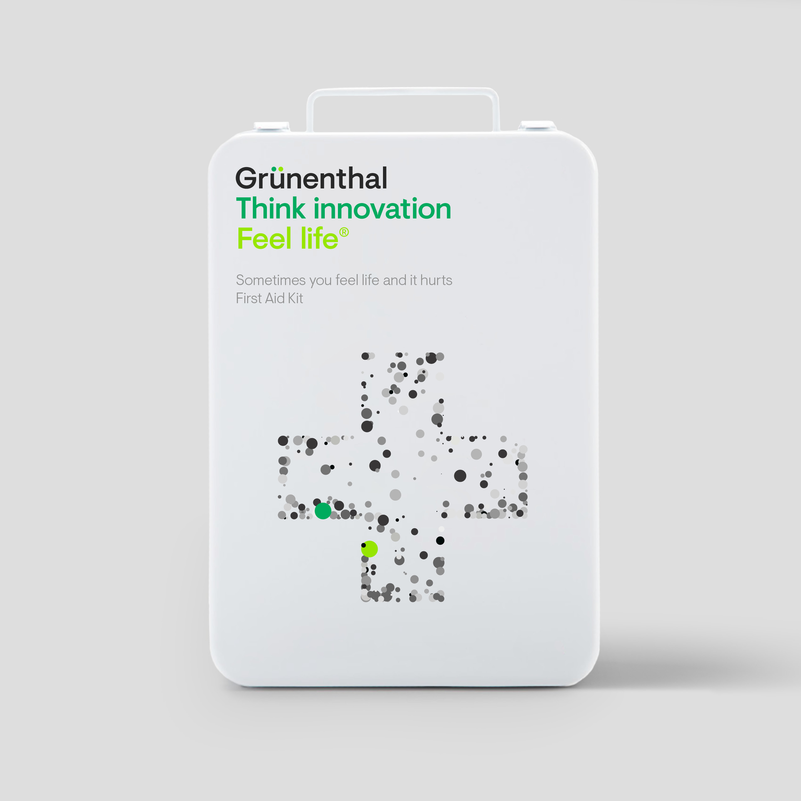
To this day, Grünenthal's guiding principle is to “Think Innovation. Feel Life.’ a healthy balance between rationality and emotion, science and application.
It’s at the heart of the brand. The symbol, a derivation of the sign for scales, represents balance. The ‘characters’ that live within the wordmarque represent the balance of ‘innovation’ and ‘life’. Together they are expressed through illustrations, photography and motion graphics.


-
Studio:FutureBrand